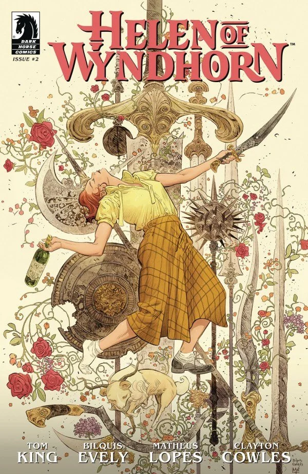
Helen of Wyndhorn #2: Creatures and Cigarettes
Reviewed by Seth Adrian Romo
Helen of Wyndhorn #2 is another rich entry in this series as it gracefully weaves plot and character growth. The depth in which the words and art collaborate is nothing short of fantastic as there are large and small elements that benefit the reader with each read.
While the first issue introduced Helen, an orphaned teenager with a drinking problem, this follow up chapter presents a worthy adversary to the rambunctious protagonist. As she now lives in her grandfather’s mansion—the same man who hired Lilith to care for Helen—it’s clear the world she knew in fantasy books may be more fact than fiction.
The issue begins with Helen frustrated at her grandfather, a large man named Barnabas, after witnessing him behead a large wolf-like creature at the end of the first issue. Where Helen often dictates the tone in every room she is in, she quickly struggles as the more questions she asks, the less information she receives. It’s a great plot element to include from writer Tom King as the first issue highlighted how much of a brat Helen can be. Granted, she is written to be complicated, and this issue gives moments of growth and struggle that make for a dynamic lead in this fantasy story.
The story continues to be interesting as Helen struggles against the lack of information provided by her grandfather the few times he decides to join them at the dinner table. King’s use of the dinner table is particularly clever as the place often associated with comfort and family continues to be a place of disjointed individuals struggling with each other while a beautiful bounty of food sits in front of them. It’s smart and despite the lack of action, keeps tensions high.
While the overarching story is fragments of Helen’s history told to a reporter, the shift from past to current time may be jarring for readers. It’s not difficult to understand what is going on, but it may feel like it takes readers from the core story of Helen. Luckily, this is a small note as the writing is still solid and matched with illustration and colors.
Artist Bilquis Evely and colorist Matheus Lopes operate with such finesse in their visuals. In fact, some readers may find themselves spending a few minutes to just appreciate the deeps browns from wood and books of the mansion and lush greens from the gardens the characters explore. Aside from mansions and landscapes, the skills from Evely and Lopes stand out most when it’s Helen and her Grandfather talking as their physical similarities become apparent from their eyes to their facial structure. This adds to a deeper connection of the two despite being completely separated for most of Helen’s life and it’s another element of storytelling that makes the experience all the better.
Final Verdict
From start to finish, the entire creative team is clearly on top of their game. Every letter and artistic detail is the epitome of intentional storytelling and the themes, symbolism, and world building continue to be top notch.
| Criteria | Score |
|---|---|
| Writing | 9 |
| Story/Plot | 9 |
| Art/Line Work | 9.75 |
| Colors | 9.75 |
| Final Score | 9.4/10 |
Creative Team
writer: TOM KING
artist: BILQUIS EVELY
colorist: MATHEUS LOPES
letterer: CLAYTON COWLES
publisher: DARK HORSE COMICS

